Project
To create a landing page for an e-commerce website selling musical instruments and also an ad for social media.
The Brief
To create a design for an online store that sells musical instruments. The design must address different KPIs.
The design must include these elements:
- An ad on social media to attract visitors to your site
- A landing page that is representative of what you advertised
- A product overview page shows more images and information and provides a method to proceed in the purchase process.
The target group of the design:
- They are typically 20 – 35 years old.
- They play more than one instrument.
- They are able to understand complex musical instrument interfaces but they appreciate user-friendly and intuitive ways to achieve their goals.
- They place a lot of value on good design but also need to read details to know that their choice of the new instrument will be right for their needs.
Design Process
Research
Choosing the Musical Instrument
To start the project, I had the freedom to choose the musical instrument that I want to use as the main item of the online store. Because of my personal preference and also the fact that it’s quite a niche product, I chose Violin as the main musical instrument.
Competitor Analysis
To know what type of design approach I should do for the landing page I did a quick competitor analysis by browsing different e-commerce website that sells violins. From the research, I could see that most of the websites chose to keep the design simple and almost as they use the same type of template, with white background and grid system.


Ideation
Persona
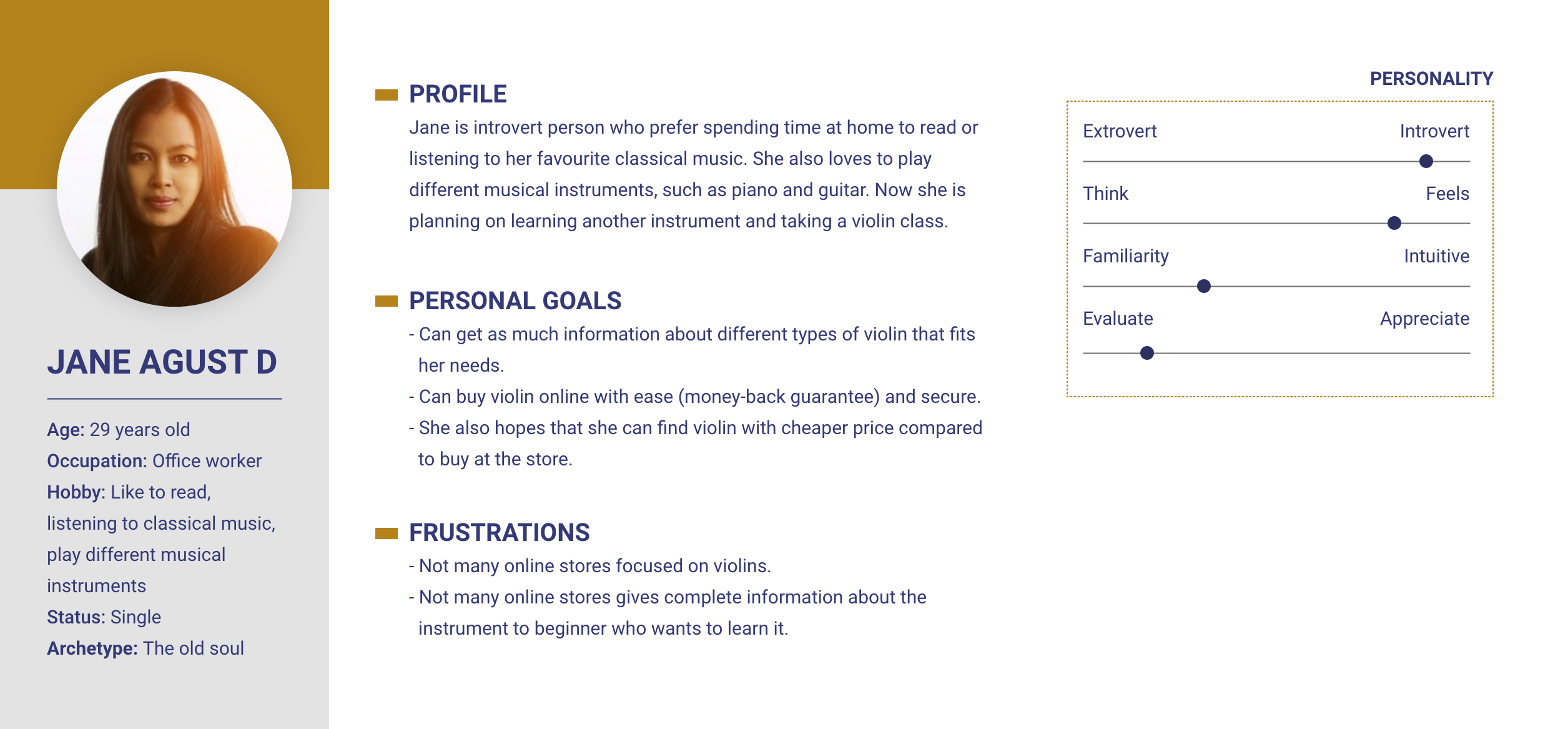
From the target group listed in the brief, I could create a persona to help me see what type of goals and pains I need to address in the design. Here I want to focus on the frustration area where Jane, as a beginner, feels like she cannot get enough information about the instrument she wants to buy.
Sketches
I created a few basic sketches to help me visualise some of the ideas I had. For the above-the-fold area, I wanted to focus purely on visual impact to make a different impression compared to the competition. Using an asset of a best-selling product or focusing on a certain user group (in this case a beginner violin player).


Design
Set Up Styles
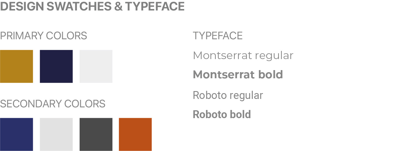
From the competitor analysis result – focusing on the visual of their website – I could then start with setting up a style that could make a bigger impact and set the brand apart. To help me with the visual, I add Modern, Classic, and Dramatic as keywords guide.
I chose bold colours of a rich combination of blue and gold to show the dramatic and classic look.
KPIs to Address
Another factor that I consider while creating the landing page layout is the KPIs that I have to address. This helps me know what features need to be there and how they will help the customers.
Bounce Rate
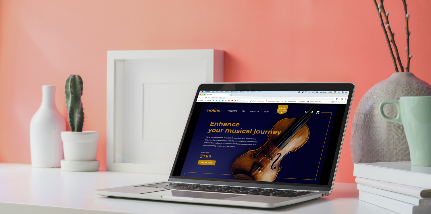
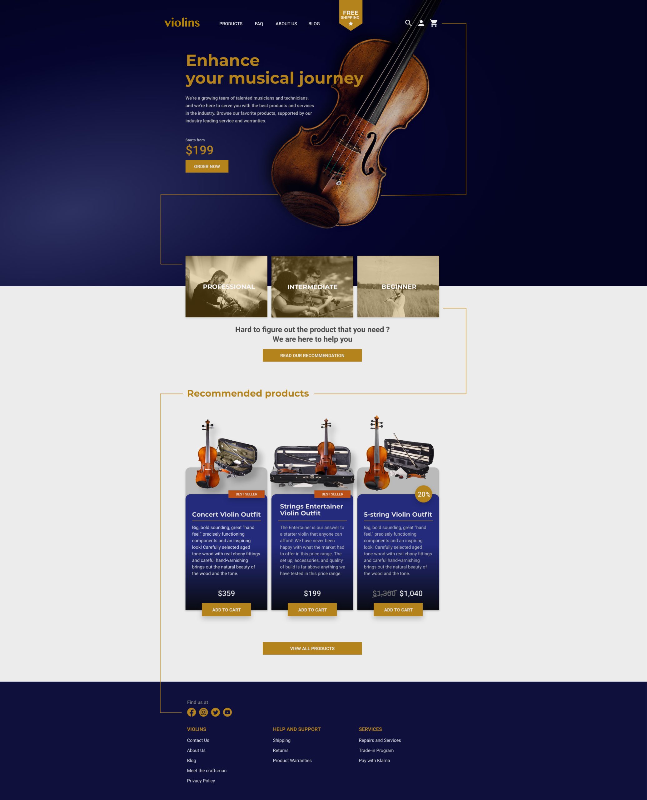
Creating a design that appeals to the eyes and with enough information to catch the attention of the user that visited the site (big headline title, asset as the vocal point and additional information, such as the free shipping banner), without making them feel overwhelmed and make the site looks too crowded, I try to make the bounce rate as low as possible.
Pageviews per Visit
Dividing the information into different more focused pages can create a higher page view per visit. But of course, keeping the clicking process short is also important. That’s why I try to create a few products panel so that the user can easily cut the process.
Time on Site
By providing a Blog page and a link for product recommendations, I try to make the user spend more time on the site. With more information they can get about the product they are looking for, the longer they will stay and browse the site.
Design Samples
From the sketches, the design styles and the KPIs, I have now enough information to create a visual of the landing page, the product page and the ads.
Landing Page
The above-the-fold area focuses on the assets and the tagline of a specific product (in this case, a violin for a beginner). The journey then continues to an area where customers can get a recommendation for violins based on their level. After that, the customers could also see recommendations based on “Best Seller” or products on promotions. Since this was a design of a landing page, it was kept short to show enough information for the customers to explore deeper.

Product Page
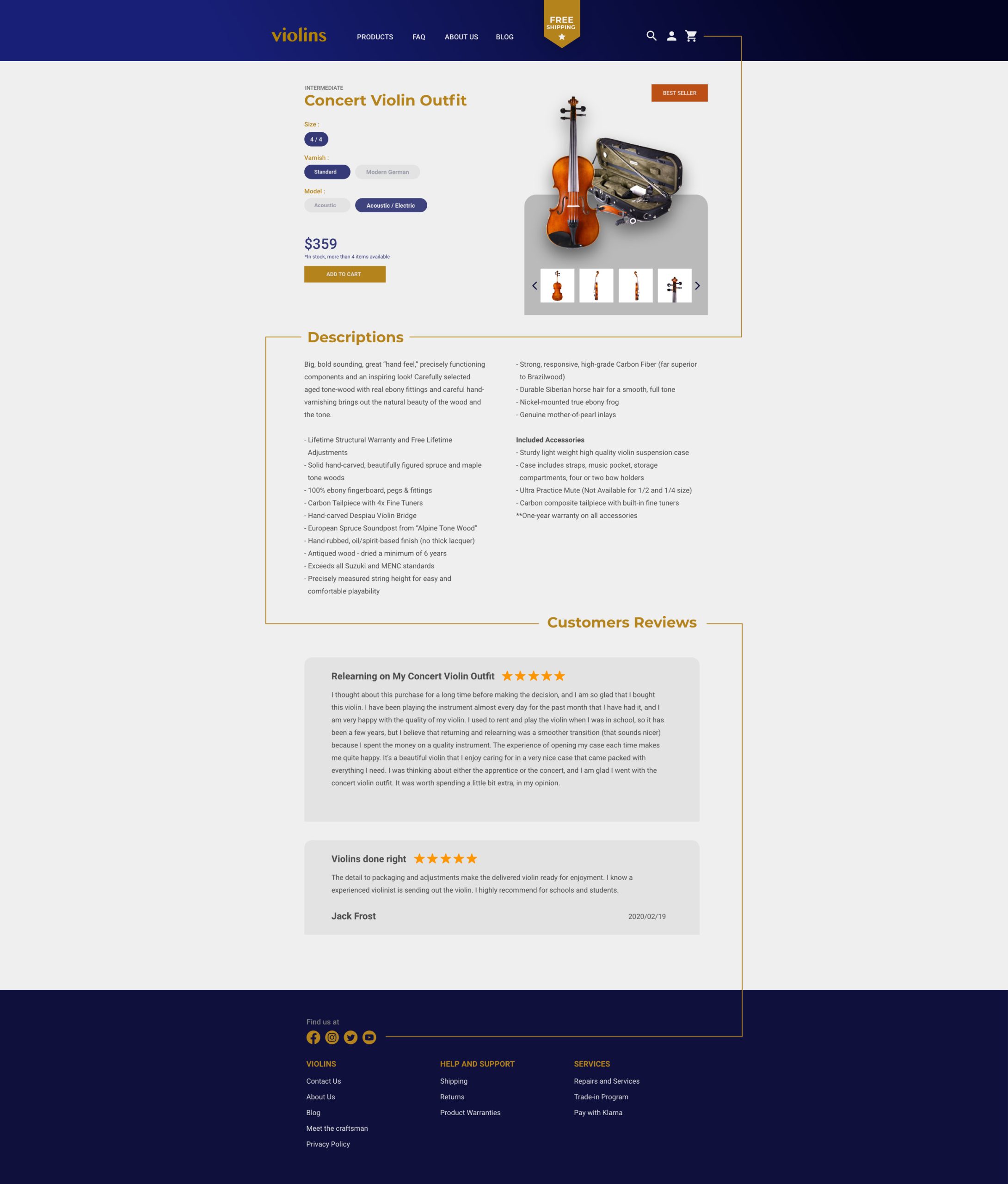
Keeping the same visual system as the landing page, the product page tries to help the customers to add the product to the cart and finalise the purchase. To help the customers make their decision, I added information such as:
- The images of the product from different angles make sure the customers see everything before they commit to purchasing.
- The “level” of the violin helps beginners to know if this product to advanced for them or not.
- The details of the product (size, varnish, model).
- The materials of the product.
- The accessories included.
- The additional information around the product.
- Stocks indicator if the product is available right now.
- Customers Review to help customers who want to do their due diligence before buying.
Ads Design
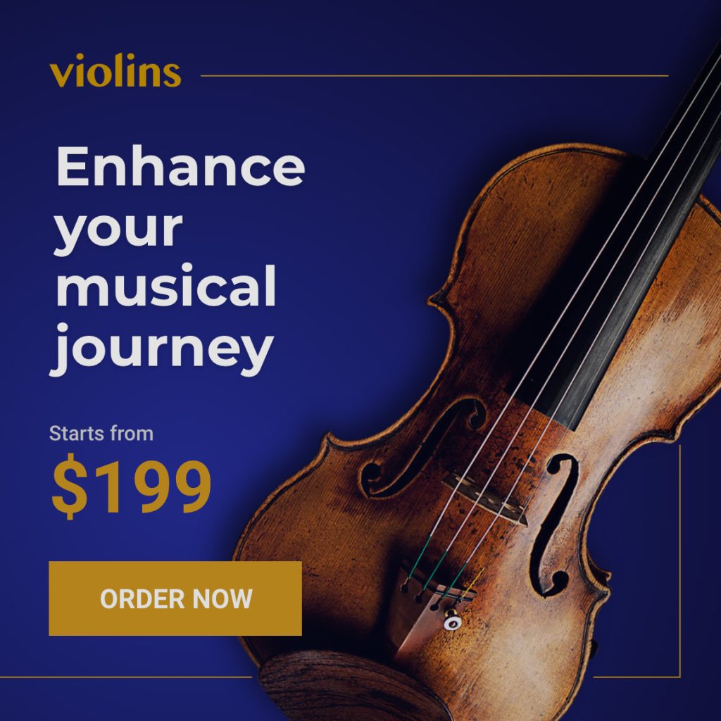
For the design of the ads, I took the same visual cues as the landing page to make it visually cohesive. I took two different approaches to the ads. One focuses on the product for the more technical type of customers who knows the instrument well. The other approach focuses on the emotion of the viewer. With the hero image being a person holding the musical instrument outdoors and then adding the tagline, it appeals to the experience of using the musical instrument – targeting a broader audience that is less technical.
