Project
Mobile app for helping beginners take care of their plants.
Methods
Research (User interview, competitor analysis), Ideation (empathy mapping, journey mapping, concept, user story, flow chart, wireframes), Design (hi-fi mock-up).
The Background
This was a time-based design assignment (around 8,5 hours) to create a mobile app that helps millennials who understand the importance of a plant-rich, organic feel in their homes and are buying plants without knowing how to look after them. Focusing on the things that are essential for the users who know little to nothing about what it takes to keep their plant(s) alive.
My Suggested Solution
For this project, since it’s a time-based challenge, for the UX area, I focused on the Discovery and the Explore steps of the design process, then continued with the UI part of creating the visual of the app.
Research
User Interview
To understand the users better about what they feel and what they need before buying plants, and to pinpoint the problem that makes them frustrated when trying to take care of a plant, I conducted research by sending a google form survey to a few individuals who were within the millennial age group. The questions included were for example: what is the user’s overall feeling about taking care of plants, what are their sources of information when it comes to taking care of plants, what is their frustration and so on. The survey was done by 6 participants.
From the questionnaires, there are a few findings that are interesting to highlight:
- All of the participants think that the first consideration before they buy or get a plant at home is that the plant should be easy to take care of.
- More than 80% look for tips & tricks on how to take care of a plant from either online or from family and friends.
- 83% look for general information about the plants and how to water them as the type of information they feel is important to know.
- All of them feel that the most important feature that would help them take care of the plant is a reminder to water the plant. Follows by tips and tricks and if the plant fits a certain room.
- 50% of participants feel that it’s fun to have plants in their homes, 33% feel overwhelmed and 16% feel fear that it’s going to be a waste of money.
Note of improvement
Things that I would like to improve from this process are the type of questions included in the questionnaire. After I sent out the link, I noticed that I missed a few questions that could’ve added more insight into what the user thinks and feels about the subject.
Competitor Analysis
This research process was done by downloading different apps available that offer the same type of purpose, to see what type of approach they use to answer the user’s needs. From this process I could see that most of the apps decided to be some type of pocket encyclopedia, focusing on plants. This of course valuable since it’s informative but lacks interaction with the users.
Note of improvement
I wish I could spend more time really using some of the apps and get a better look at what approach would be beneficial for the app I am working on.
Ideation
Empathy Mapping
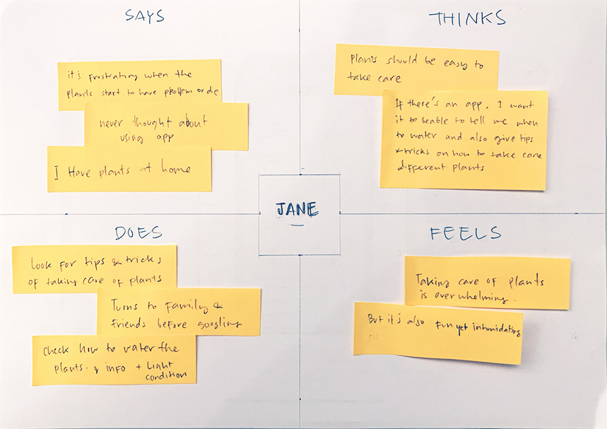
The next step was to start exploring the data from the survey I did. I chose to do empathy mapping instead of creating a persona (or proto-persona) because it was the fastest and more straightforward way without losing too much information. By starting to set up what the user (named Jane) says, thinks, does and feels, I could start to see what approach should I do to answer her needs and relieve her pain points and frustrations.
Journey Mapping
Next was to map Jane’s journey when facing a certain problem. This one was a journey she had to take to find information on how to water the plant she just brought home. Within this step, I tried to figure out what were her high and low points during the process. I could also try to set up the expectations for the journey.
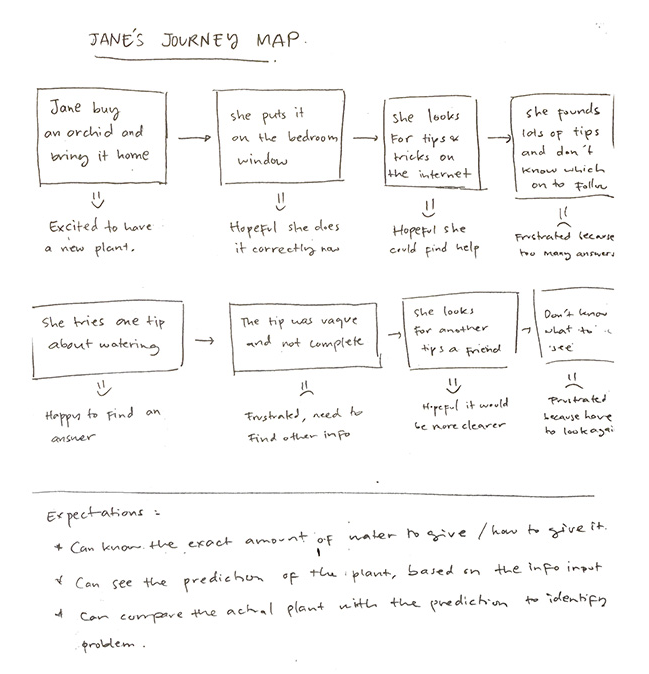
From this journey map, we could see her expectations:
- Get info of the exact amount of water needed and how to give it.
- Can see the progress or prediction of the condition of the plant, based on the data input.
- Can compare the actual plant with the prediction to identify the problem.
Creating Concept
From the data, I could then try to conceptualise what the Plant Care app should be.
App Concept
Plant care app is an app that will help individuals who love plants but have little to zero experience in taking care of them. The app would try to show the actual progress of the plants, mimicking a sports app where the user could enter a different status of the plants and then create a plant diary. This way the user would feel more invested in the app and use it more than just a source of information.
Creating User Story
To help restrict the development based on the time frame of the challenge, I created a user story so the flow chart have more detailed context and end goal.
Jane bought an orchid and she has no clue how to take care of it. As a beginner in planting, she wants to know when she needs to water the plant and how to water it. She would also expect some type of tips or additional information about the plant so that her plants can thrive and stay alive for a long time.
User Story
Flow Chart
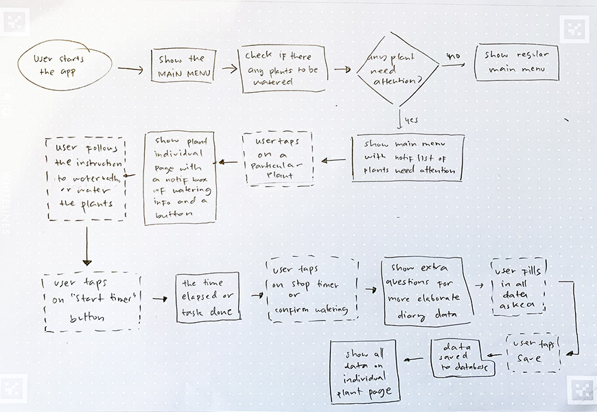
One of the processes that I always try to do is to create a flow chart. This process, in my opinion, makes communication with the developers or engineers much easier. By doing this process, I could get inputs from them, especially when it comes to the sad paths (error states or other areas that might be forgotten).
Lo-fi Wireframes
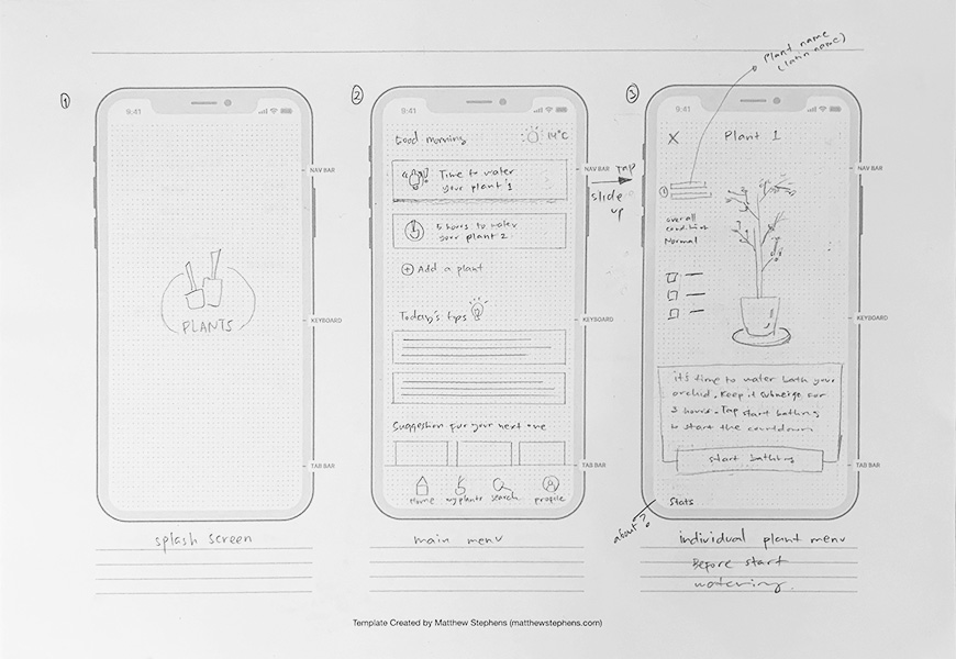
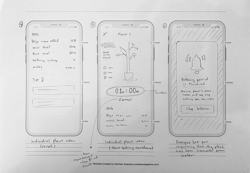
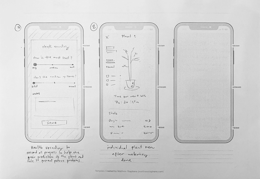
With the info from the flow chart, I started to create the lo-fi wireframes by sketching them on a printed template of an iOS device. During this process, to save time, I also try to sketch out the look for the UI later on.
DESIGN
Because of the time constraint, I skipped building a mood board and worked directly from the wireframes. First I tried to set up the colour scheme for the visual of the app and the typography.
Colour Scheme

Typography
Museo Sans – weight 500, 700
Hi-fi Mockup
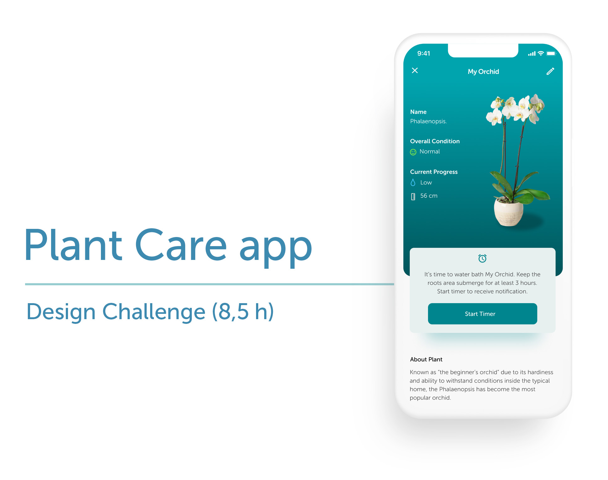
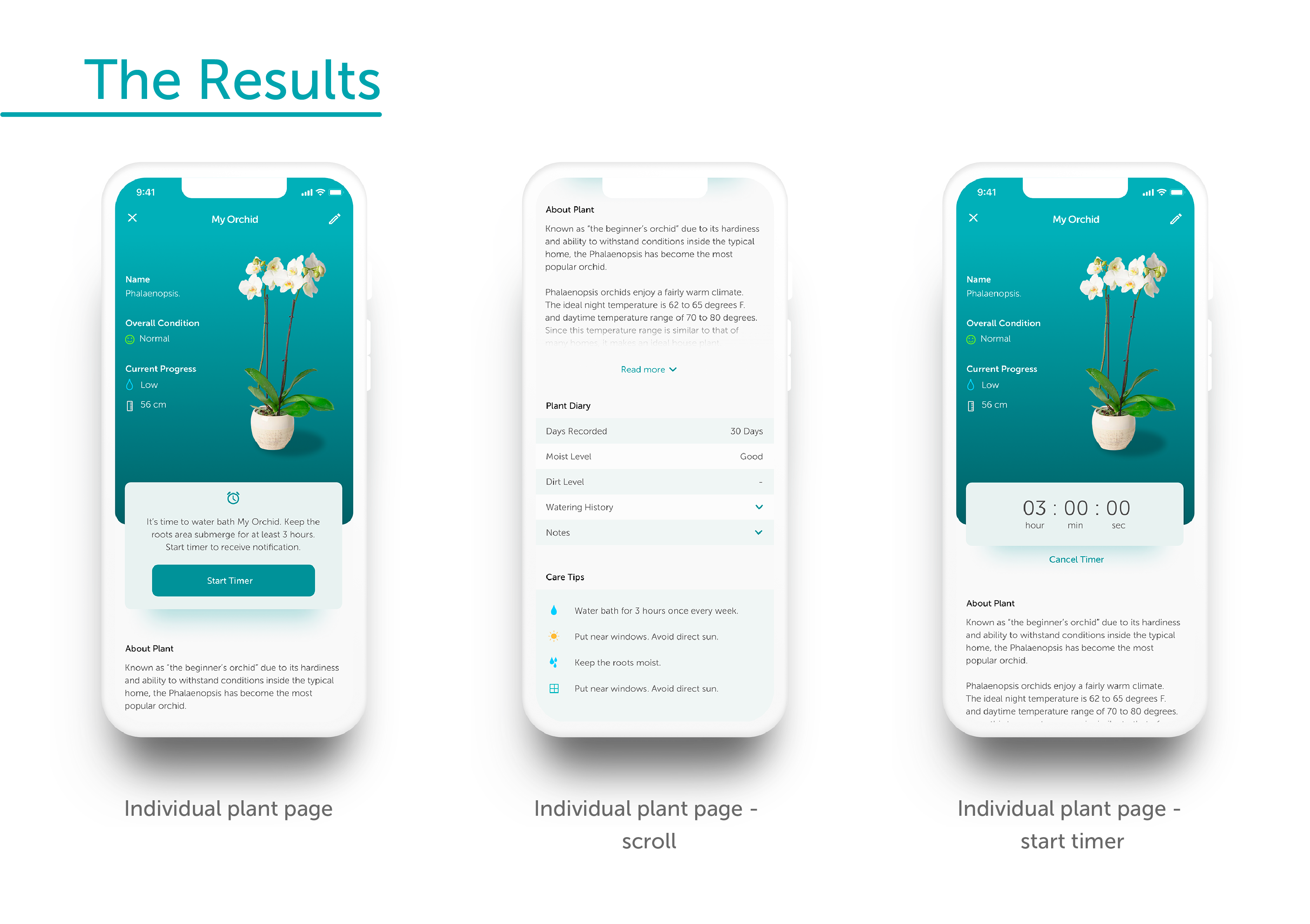
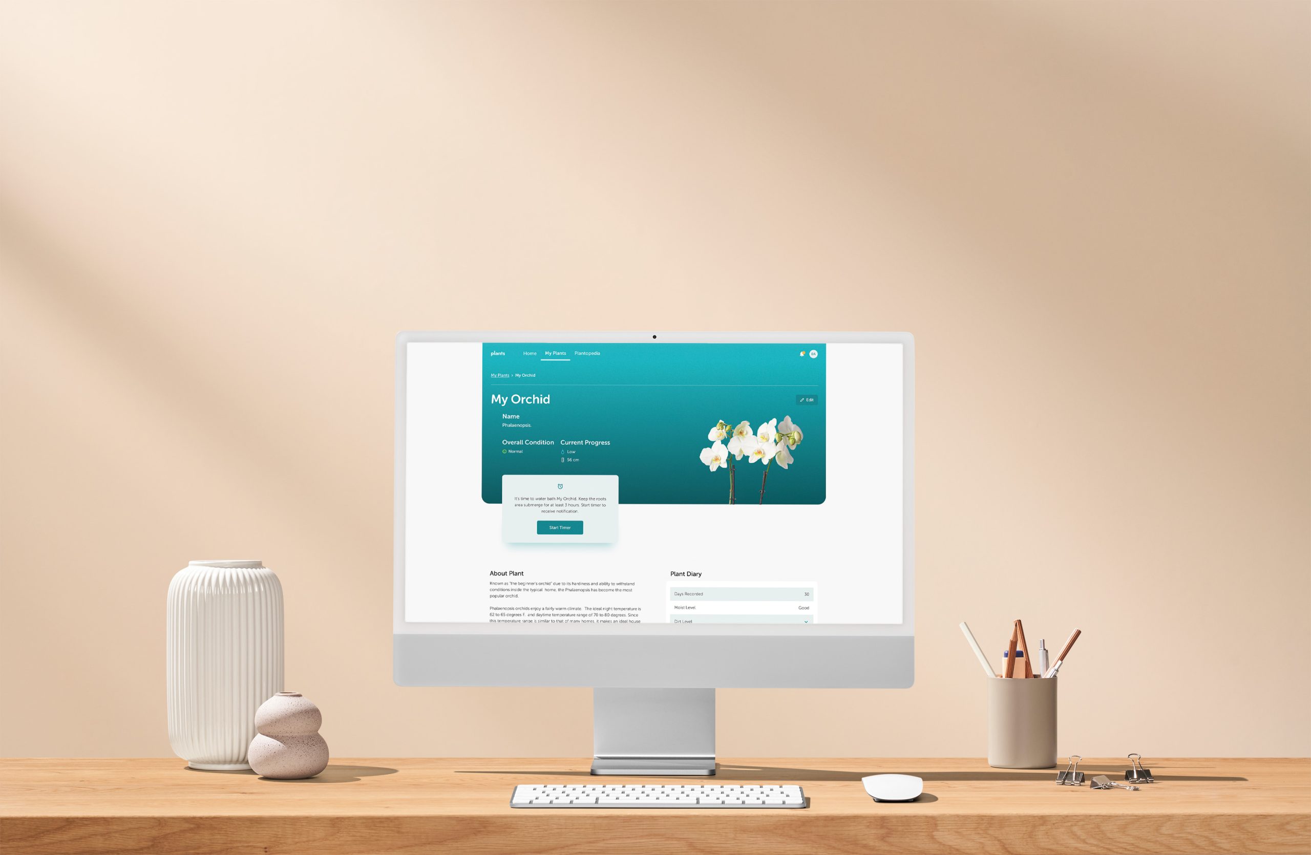
The screen that I decided to create as the mockup is the individual plant page (screen no. 3). I chose that screen because it represents the whole flow of the UX process. On the page, the user would be able to see the notification for the watering (or water bath on certain plants). The user could then set up a timer from the app to be able to receive an alert when it’s done. This is to create a more wholesome journey and keep the user interacting with the app as often as possible. On the screen, the user could also see the progress of the plant, for example how long since they started recording the progress, the moist level, the watering history, and also notes they write along the way. There are also some care tips and an about section to give more knowledge to the user.
Note of improvement
Creating a full UI takes time and to be able to focus more on the UX process, I tried to spend as little as possible here. As a result, I noticed a lot of things that can be improved, such as small mistakes on icons and UX writing for different parts of the screen. I’m also lacking knowledge of taking care of plants and it reflected in the type of information shown. I feel that even if we need to focus on the user, sometimes as an “educator”, there is some knowledge that can pass down to the users, regardless if they need it or not.
Conclusion / Reflection
From the brief given, I think I managed to propose a solution that could work well for both the product owner and the users. I tried to base all my decisions on the research results and also from the business perspective on how they should position the product to rise above the competitors.
Because of the time constraint, there would be a lot of steps or details I missed (which I tried my best to elaborate further on what I could improve on each part), but overall I am really satisfied with my suggestion.
