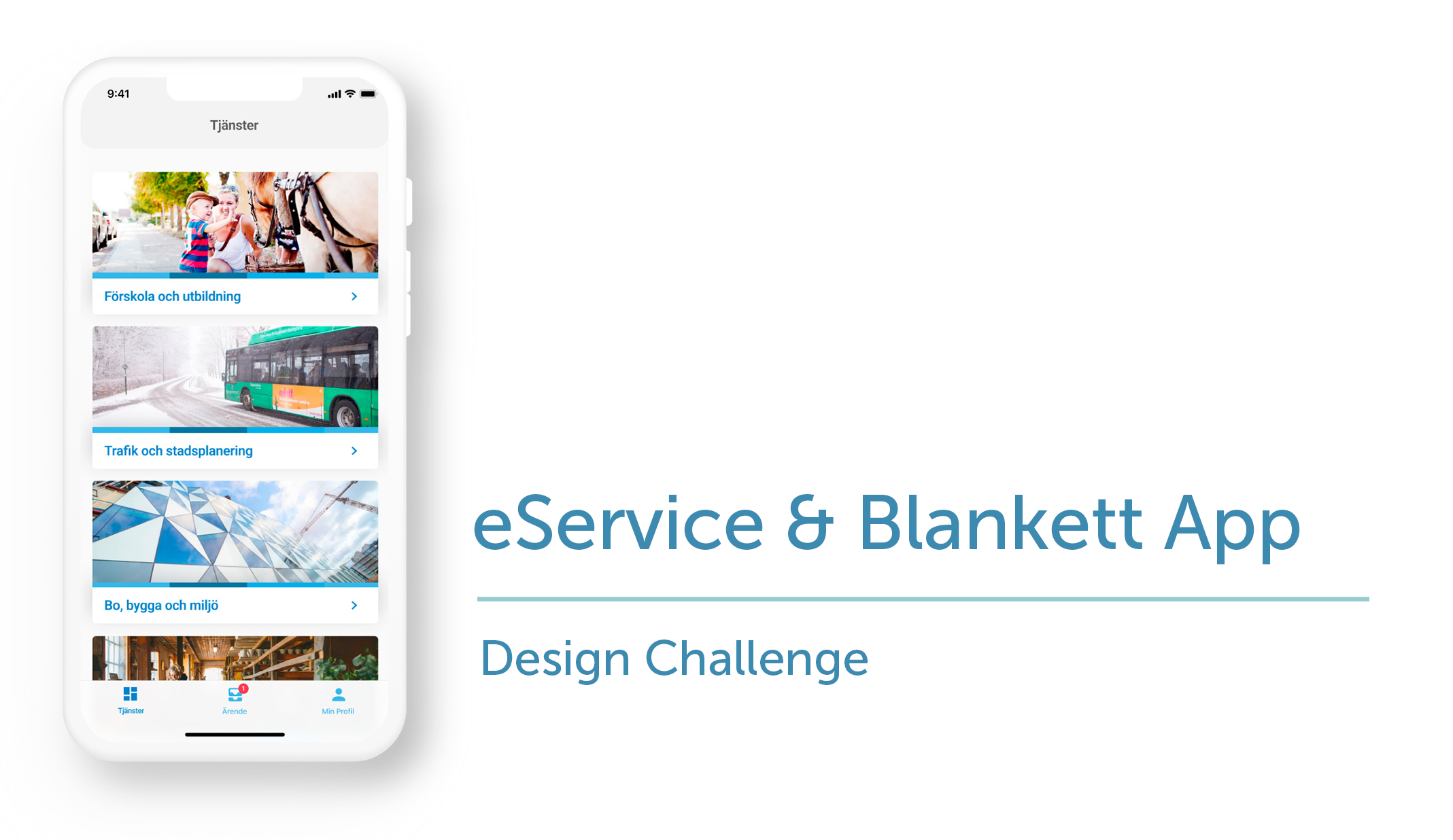
Project
To create a sample prototype of a mobile app version for the eService & Blankett website.
Methods
Research (user interview), Ideation (App concept, User journey, Proto-persona, lo-fi wireframes), Prototype.
The Background
As part of a time-based design challenge from HbgWorks (less than 10 hours), I was asked to create the app version of the eService & blankett website from Helsingborg municipality. I would need to analyse the website and translate the features to fit the app version. From the findings then I have to create the concept and provide a solution with a clickable prototype.
The Suggested Solution
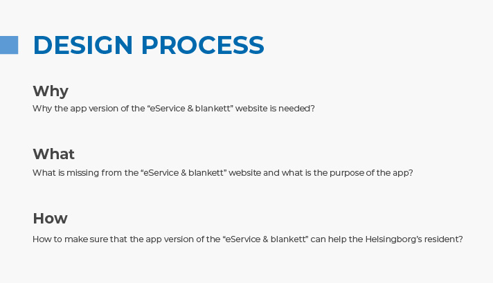
Research
Problem Framing & User Interviews
To start the process, I tried to do some problem framing by trying to answer these questions.
To get the answers to those questions, I conducted user interviews with two people living in Helsingborg to find out the problem and their needs with the website. The interviews were done through a one-on-one conversation where we went through the website together and discussed the available features. We also discussed what they expect to get from the app version and asked them to create their user journey for a specific scenario.
From the interviews, the interesting points that came up were:
- The current website feels like a portal to a lot of other websites. So to try solving a task takes so many steps and different pages to go and things to read.
- If there’s an app version of the app, then they expect that the app could let them do the task directly.
- For filling out forms or applications, 50% of the participants like to use a website compared to an app, because they feel it’s safer and easier.
Based on the interview, I could also start framing the problem:
The residents of Helsingborg municipality need a safe and easier way to do their errands with the local municipality offices.
Ideation
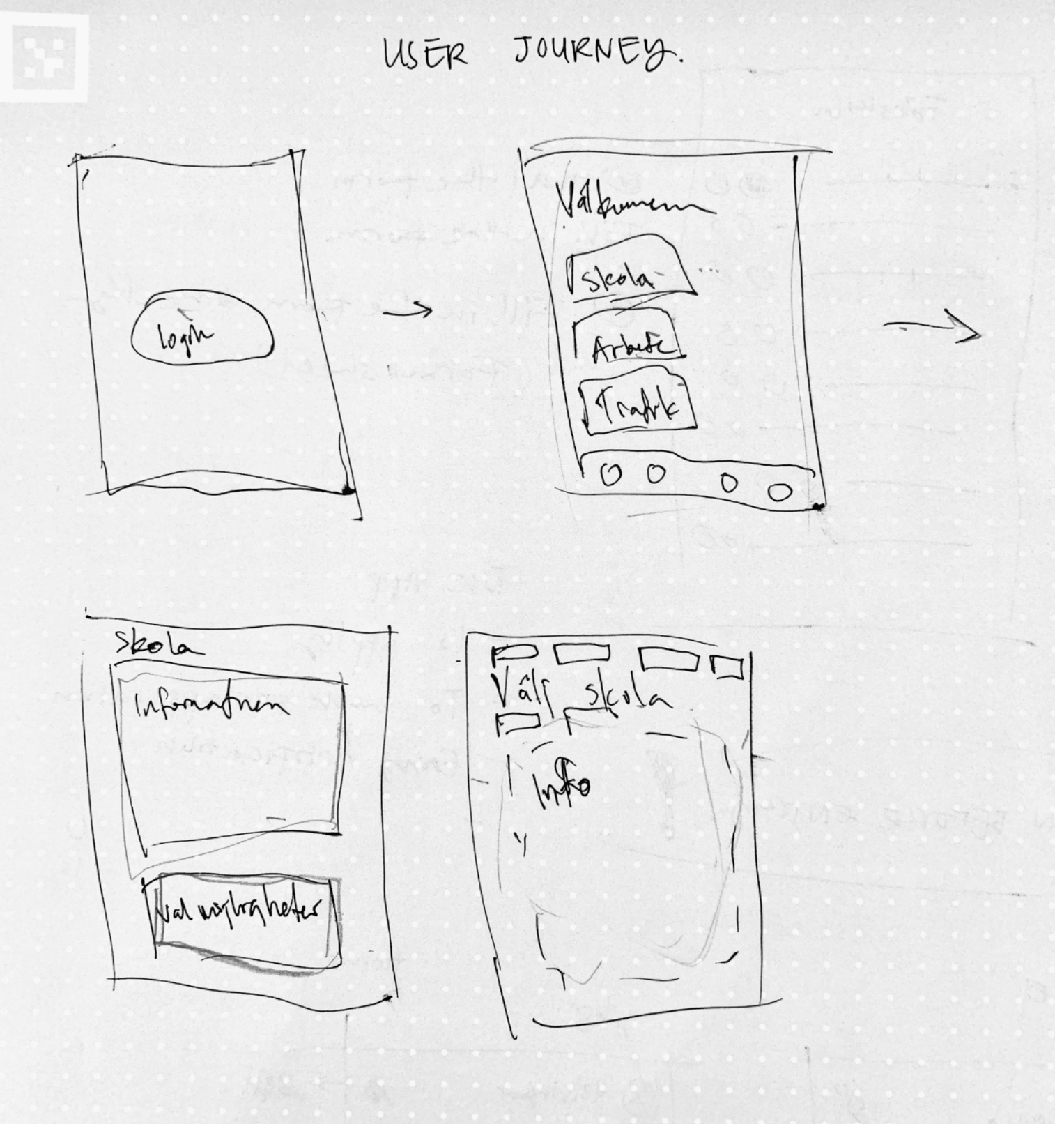
User Journey
As part of the user interview, I asked the individuals to create their own journeys when trying to do a certain task in the app. In this case, I asked them to draw a flow of the app when they want to apply for kindergarten for their daughter.
This process gives me valuable insights into what is intuitive for them and what they expect the app to be able to do.
Creating the Concept
From the interview, I could then try to create a concept of the app that could help them to use the same functionality as the website version but focus on a specific thing.
The concept
To create an app that is action-based where Helsingborg’s residents can safely apply or send applications easily to different offices within Helsingborg municipality from their phones, without needing to go through different websites. They can also monitor all the applications they have submitted easily in one place. I envision this app would start with a few services that the user can apply for at first, then it will grow with time. In the end, it will centralise the application system for whole project areas within Helsingborg municipality.
Main Keywords
To help create a clear vision of the app, I set up a few main keywords that would describe the app as a whole. They are easy, centralised, convenient, safe, and action-based.
User Story
As a father, I want to be able to easily apply my daughter to a kindergarten so I make sure that she has a spot at a school nearby our home.
User story
Sketches
Based on the user story and the user journey created by the participants, I could then see how they envision the app would be and what type of interaction they expect they could do in the app to complete the task asked. This gave me a great base to then expand the design and the flow to focus on helping them to do the task they want to do.

Flow – Wireframes
With all the data collected, a flow wireframe was then made. The idea of the app is to make sure that the users can feel safe interacting with the app and can easily fill out forms or applications without needing to go to different websites all the time. To help them feel safe and that their personal data are secured, the app offers the possibility to log in using Bank ID. The users can then directly apply for school from the “Service” tab. They could also follow any other applications they have active from the app.

Design
Design Approach for the Main Screen

To keep the look consistent with the website, I used the design system provided by HbgWorks. This includes the typography, the graphical elements and image assets.
As the app would grow with more services, a simple design was chosen to make sure that it doesn’t need any drastic changes.
To make the app inclusive to all, the main screen has a high colour contrast and reduces the dependency on colour by adding extra elements such as an icon and shadows to show the clickable card.